what you need to know
- Google is known for constantly changing its Android app interfaces and is considering relocating the search bar to the bottom, a concept it has been testing since 2021.
- A new experiment involves a Material 3 redesign of the bottom bar that includes a pill-shaped search field.
- The updated design introduces a default blue hue, replacing dynamic colors, to enhance visual appeal and modernize the look of the app.
Google’s Android apps like to change things up, especially its interface, and it’s back again, putting the search bar at the bottom. This experiment has been in the works for some time, starting back in 2021 and reappearing in late 2023.
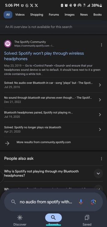
As users on X discovered (via 9to5Google ), a new test is underway. Google is apparently working on a Material 3 redesign of the bottom bar, putting the pill-shaped search field directly into the bottom bar itself.
Probably the biggest visual change is the search bar. Currently, it sits at the top of the app, but the redesign will move it down above the bottom bar. This may seem like a small move, but it actually makes it easier to get to the bar no matter which phone you use.
The move could be Google’s way of acknowledging that our phones are getting bigger. The search giant may have decided that placing the user experience elements at the top might not get as many clicks as it wanted. Therefore, placing search at the bottom makes it easier to click and makes your search experience smoother.

In older versions, the search bar shrank when you actually started searching. Now, whatever you want, keep it big and bold.
In the updated design, Google replaced dynamic color The default blue tint, does pop up on search results pages. The redesign of the bottom search bar gives Google apps a more modern feel compared to its current look.
One big change you’ll notice is that the “Google” logo is no longer at the top in this redesign.Instead, you’ll see search filters such as picture, video, informationand more immediately.
However, this shift means taking up more space that could otherwise be used to display search results.
Of course, the new design may reduce the number of search results you see first, but hopefully it will make searching overall easier and faster to use. We’ll have to see if it works when they roll it out to everyone.